The Complete Guide to Shop Floor Displays and Layout: How to Organise Your Spaces Like a Pro
Organising your retail space is far more than simply arranging products on shelves. It is about creating a journey that invites customers in, guides them through your boutique or shop, and gently encourages them to linger, explore, and ultimately make a purchase. The way you design your shop floor displays and layout can significantly influence buying decisions, turning casual browsers into loyal customers. Whether you operate a small boutique, a bustling supermarket, or a trendy popup shop, understanding the principles of effective space planning will help you maximise every square foot and create an environment that feels both welcoming and strategic.
Creating the perfect customer journey through strategic floor planning
When a customer steps through your door, they embark on a journey that you have carefully orchestrated. The first few moments are crucial. Research suggests that most shoppers instinctively turn to the right upon entering a shop, so placing your most enticing products or displays in that direction can capture attention immediately. The longer a customer spends in your space, the more likely they are to make a purchase, so your layout should encourage exploration rather than a quick dash to the checkout.
Understanding Traffic Flow and the Natural Browsing Path
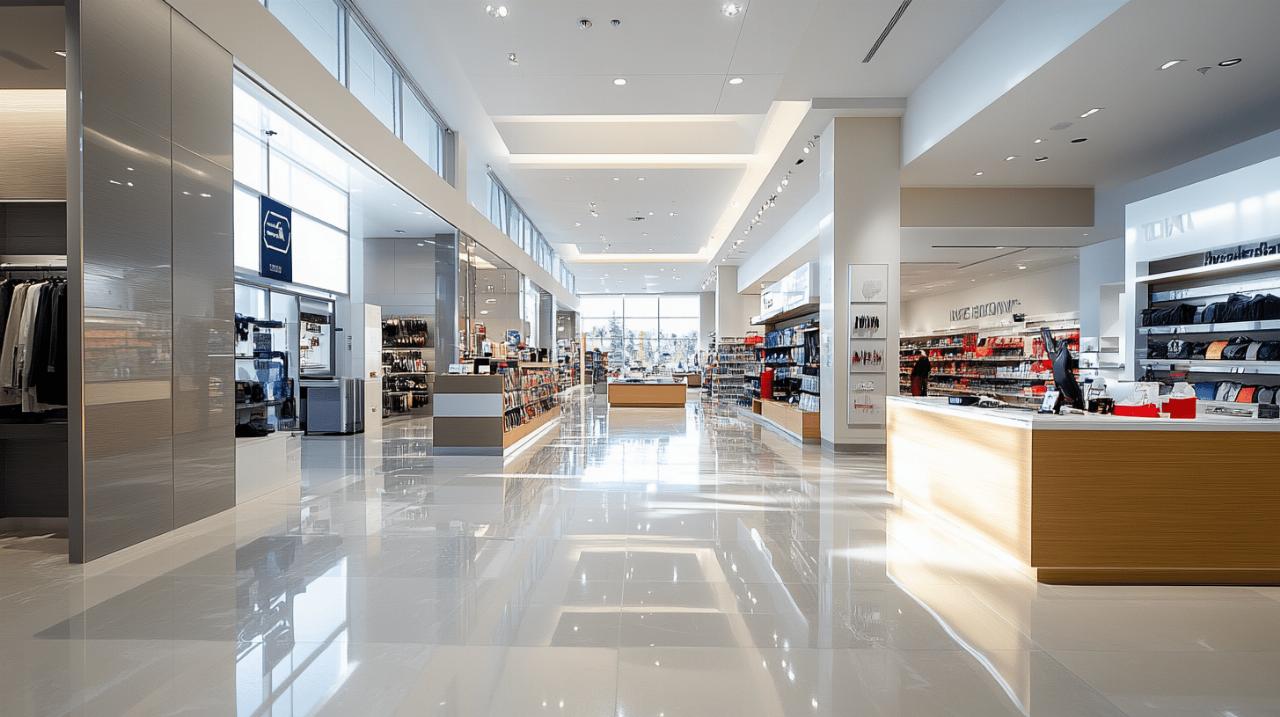
Traffic flow is the invisible current that moves customers through your retail environment. Understanding this flow allows you to position products and displays where they will have the greatest impact. A grid layout, commonly seen in supermarkets, maximises product display by organising aisles in a structured, predictable manner. This approach works well for shops with a large inventory where customers expect to find everything they need in a logical order. However, for smaller boutiques or luxury retailers, a free-flow layout might be more appropriate. This design encourages wandering and creates a more relaxed atmosphere, perfect for shops where the experience is as important as the products themselves. A looped or racetrack layout guides customers along a set path, ensuring they pass by as much merchandise as possible. This is particularly effective in smaller shops where you want to showcase a wide range of items without overwhelming the space. On the other hand, a forced path layout, famously used by certain Scandinavian furniture retailers, takes this concept to the extreme by leading customers through a predetermined route. Each type of layout has its merits, and the choice depends on your products, your space, and the experience you want to create.
The psychology behind effective retail space organisation
The psychology of retail design is a fascinating blend of art and science. Colours, textures, and patterns all play a role in shaping how customers feel as they move through your shop. Inviting colours can create a warm, welcoming atmosphere, while bold patterns can draw the eye to specific areas or products. Staying on top of seasonal trends ensures your shop feels current and relevant. Beyond visual elements, sensory experiences such as scent and music can have a profound impact on customer behaviour. A pleasant fragrance or a carefully curated playlist can make shoppers feel more comfortable and inclined to spend time browsing. Creating breaks and stopping points within your layout encourages customers to pause and consider products more carefully. These moments of rest can be as simple as a well-placed seating area or a striking display that invites closer inspection. The goal is to design a space that feels intuitive and enjoyable, where every element contributes to a cohesive and engaging experience.
Maximising Impact with Point of Sale Displays and Shop Floor Stands
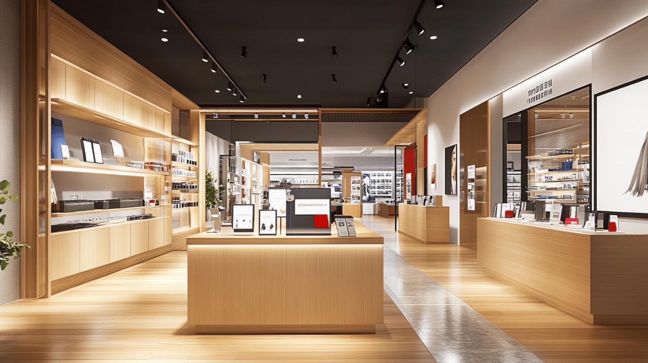
Shop floor stands and point of sale displays are among the most powerful tools in your retail arsenal. These fixtures do far more than hold products; they highlight special offers, showcase prominent features, and create focal points that capture attention. The right display can transform a simple product into something that feels essential, driving sales and boosting customer engagement.
Choosing the Right Materials and Multi-Tiered Solutions for Your Boutique
When selecting materials for your shop floor stands, consider both aesthetics and durability. Cardboard displays are cost-effective and can be customised with vibrant graphics, making them ideal for temporary promotions or seasonal campaigns. Foamex and PVC offer a more polished, professional appearance and are well-suited to long-term use. Multi-tiered stands are particularly effective for maximising space and showcasing a range of products at different heights, ensuring that even customers at the back of the shop can see what is on offer. These stands create visual interest and make it easier for customers to browse without feeling crowded. Slatwall and gridwall systems are excellent for maximising wall space, allowing you to display a variety of items in an organised and flexible manner. Slatwall panels can start at just over ten pounds, while gridwall systems are similarly affordable, making them accessible options for shops of all sizes. Twin slot systems offer another versatile solution, providing adjustable shelving that can be reconfigured as your product range evolves.
Strategic Product Positioning to Drive Sales and Customer Engagement
Where you place products within your shop can have a dramatic effect on sales. High-margin items should be positioned at eye level, where they are most likely to catch attention. Cross-merchandising, the practice of placing complementary products near one another, encourages customers to make additional purchases. For example, displaying scarves next to coats or batteries near electronic gadgets can prompt customers to buy items they had not initially considered. Planograms, which are detailed diagrams showing exactly where each product should be placed, can help you optimise product placement and ensure consistency across multiple locations. Regularly changing your layout keeps the shopping experience fresh and encourages repeat visits. Customers who notice new displays or rearranged products are more likely to explore, even if they have visited your shop many times before. This dynamic approach to merchandising demonstrates that your shop is constantly evolving and reinforces the idea that there is always something new to discover.
Designing display windows that draw customers inside
 Your shop window is the first point of contact between your brand and potential customers. It is your handshake, your introduction, and your invitation all rolled into one. A compelling window display can stop passersby in their tracks, spark curiosity, and draw them inside. Conversely, a cluttered or uninspired window can leave customers walking straight past without a second glance.
Elements of a Compelling Window Display That Captures Attention
A great window display tells a story. It might evoke a particular season, highlight a new product line, or convey the essence of your brand. Key elements include bold visuals, clear messaging, and a focal point that immediately draws the eye. Whether you use mannequins, props, lighting, or graphic panels, every element should work together to create a cohesive narrative. Snap frames and poster cases are practical tools for displaying promotional messages or highlighting special offers without cluttering the window. Chalkboard signs add a touch of charm and can be easily updated to reflect current promotions or seasonal themes. The goal is to create a display that is visually striking yet easy to understand at a glance. Remember, potential customers may only have a few seconds to take in your window as they walk past, so clarity and impact are paramount.
Connecting your window presentation to your interior layout
Your window display should not exist in isolation; it must connect seamlessly with the interior of your shop. If your window promises a trendy, modern aesthetic, customers should find that same vibe reflected in your shop floor layout. This consistency builds trust and ensures that the experience customers expect when they step inside matches the impression created by your window. Consider using similar colours, materials, and themes throughout your shop to create a unified brand experience. For example, if your window display features bold, geometric patterns, incorporate those elements into your signage, fixtures, and even packaging. This cohesive approach reinforces your brand identity and makes your shop more memorable. Additionally, ensure that the products featured in your window are easy to find once customers enter the shop. There is nothing more frustrating for a customer than being drawn in by an eye-catching display only to struggle to locate the item in question.
Testing, refining and optimising your retail environment
No matter how carefully you plan your shop floor layout, the only way to know if it truly works is to test it in the real world. What looks perfect on paper may not function as intended once customers start moving through your space. Regular testing, observation, and refinement are essential to creating a retail environment that consistently delivers results.
Practical methods for evaluating layout effectiveness
Start by observing how customers navigate your shop. Do they follow the path you intended, or do they bypass certain areas altogether? Are there sections that feel too crowded or zones that remain largely ignored? Retail audits, where you systematically evaluate every aspect of your shop floor, can provide valuable insights. Consider tracking metrics such as average time spent in the shop, conversion rates, and sales per square foot. If certain products or displays consistently underperform, experiment with different placements or presentation styles. Heat maps, which show where customers spend the most time, can be particularly useful for identifying hotspots and dead zones. Digital tools and data analytics can further enhance your understanding of customer behaviour, allowing you to make informed decisions about layout adjustments. Some retailers even use video analysis to study traffic patterns and identify opportunities for improvement.
Using In-Store Advertising and Signage to Guide Shopping Behaviour
Signage is a subtle yet powerful way to influence customer behaviour. Well-placed signs can guide shoppers towards specific products, highlight promotions, or provide useful information about your brand. Snap frames, poster cases, and chalkboard signs are all effective tools for in-store advertising. The key is to use signage strategically, ensuring it enhances rather than overwhelms the shopping experience. Too many signs can create visual clutter and confuse customers, so aim for clarity and simplicity. Each sign should have a clear purpose, whether it is directing customers to a particular section, explaining the benefits of a product, or announcing a special offer. Incorporating digital displays can add a modern touch and allow for dynamic content that can be updated in real time. This flexibility is particularly valuable for promoting limited-time offers or responding to customer trends as they emerge. Ultimately, the goal of in-store advertising is to guide and inform without being intrusive, creating a shopping environment that feels helpful and well-organised.
Creating an effective shop floor layout is an ongoing process that requires attention, creativity, and a willingness to adapt. By understanding customer flow, choosing the right displays and fixtures, designing compelling windows, and regularly testing and refining your approach, you can transform your retail space into a powerful sales tool. Remember, every element of your shop should work together to create a seamless, engaging experience that encourages customers to explore, linger, and ultimately make a purchase. With thoughtful planning and a commitment to continuous improvement, you can organise your spaces like a true professional and enjoy the rewards of a well-designed retail environment.